-
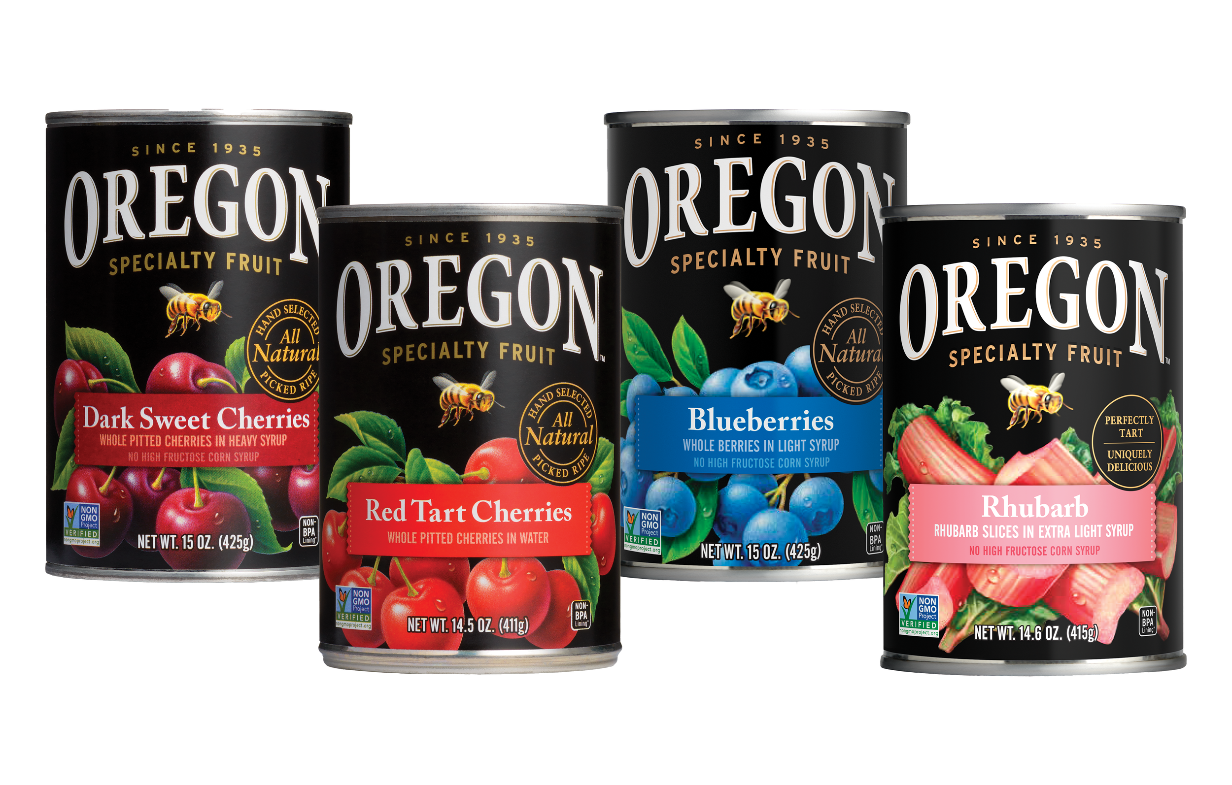
![Red Tart Cherries - Canned in Water]()
Red Tart Cherries
-
![Purple Plums - Canned in Syrup]()
Purple Plums
-
![Blueberries - Canned in Syrup]()
Blueberries
-
![Blackberries - Canned in Syrup]()
Blackberries
-
![Rhubarb - Canned in Syrup]()
Rhubarb
-
![Dark Sweet Cherries - Canned in Juice]()
Dark Sweet Cherries in Juice
-
![Dark Sweet Cherries - Canned in Syrup]()
Dark Sweet Cherries in Syrup


Project:
I was tasked with updating and redesigning Oregon Fruit Co’s retail canned fruit. The current design had been in production for over 20 years and after the company rebranded in 2024 they wanted a fresh look for their packaging. I used the brand identity to completely revamp the labels.
Beyond designing new labels I was also tasked with creating custom fruit illustrations. These illustrations were meant to have more of a heritage look than other illustrations in use because this product line spanned the 100+ years of the company’s history. I used Firefly to help create the fruit illustrations and then used Photoshop to refine and stylize them.
In addition to the design I also proposed and coordinated a special edition of the Red Tart Cherry canned fruit. A local bakeshop, Lauretta Jean’s in Portland, OR, famously uses Oregon Fruit’s Red Tart Cherries for their signature Cherry Pie. I met with the owner and worked with them to create a can label that features their signature Cherry Pie recipe. I owned all parts of this process including the proposal, design, contract and negotiation.
Roles:
Art Direction | Packaging Design | Graphic Design | Illustration | Project Management
Completed November 2024.
New labels hitting the shelves starting July 2025.
OLD CAN LABELS

REFRESHED CAN LABELS